From Worst to Best: MO's F1 Livery Hot Takes
- Mike Ogren

- Mar 25, 2021
- 3 min read
Now that pre-season testing has given us a look at the 2021 F1 grid, I’ve compiled a definitive ranking of this season’s liveries ahead of the opening race this weekend in a tiered, ascending order.
All photos used are the property of Formula 1 and Aston Martin.


How To Mess Up a Classic:

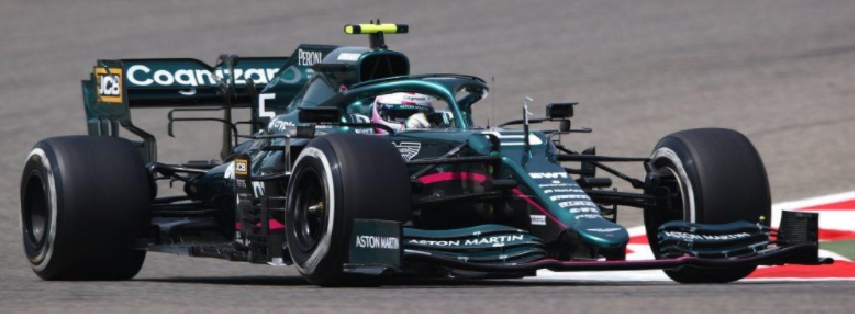
10. Aston Martin
HOW DO YOU GET BRITISH RACING GREEN WRONG?! When we learned that Aston Martin was going to be a manufacturer in F1, I think everybody was instantly excited at the prospect of a sweet BRG livery.

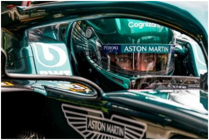
It looks marginally better in favorable lighting, but still not as it should. At least Lance’s helmet looks great with little Aston Martin wings on a color-matched lid. I am absolutely here for the Oregon Ducks vibe, but this was probably a “testing helmet scheme” and they’ll likely change to something as disappointing as the car itself.
9. Ferrari

When you have the most recognizable livery in Formula 1, it’s probably best not to mettle. I get that the fade to a darker red is a nod to their history, but it’s hard not to see the ill-conceived Jacksonville Jaguars helmets from a few years back. That would be forgivable if not for the massive neon green blight on the engine cover. After a conspicuous absence last year that everyone pretended not to notice, the Mission Winnow logo is back and impossible to miss. I honestly cannot imagine a worse choice of color and it completely ruins the most iconic color scheme in all of racing.
The Mid-Pack:
8. Williams

I actually think the Williams car looks okay. My issue is that it feels like a default livery in a video game’s “Create a Team” mode and I can’t shake that.
Bonus points for the sweet 5-spoke wheels though.

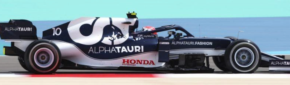
7. Alpha Tauri

Now there’s a good-looking profile. The design is simple but strong.

Unfortunately, there is no contrast at all in the head-on view. It’s difficult to tell which car this is from the front and that’s a shame.
6. Haas

It’s…fine. There’s no obvious flaws but also nothing really exceptional about it. P6 feels about right then.
5. Alfa Romeo

The Alfa edges out the Haas because their rather average overall design prominently displays their very cool logo. That’s enough to make the top half of the field.
The Contenders
4. Alpine

Renault’s rebrand to Alpine resulted in a very sharp livery. The colors make sense, they work well, and the simple stripe matching the angle of the Alpine “A” logo is one of those touches that really elevates a design.

Demerits must be made, however, for the comically boring overalls provided to their drivers. They just don’t match the car’s livery one bit! Maybe they’re another example of a “test kit” and they’ll be properly outfitted for Race 1…
3. Mercedes

The Mercs keep the black from last year. I think it looks good, and even if it didn’t the reason for it would more than outweigh my opinion. They added back in a little “Silver Arrow” and red along the car’s spine, which I don’t think works as well as last year’s look but isn’t offensive by any means.
2. McLaren

The papaya machine earns a very strong P2 on the back of its simple use of bright, historic colors. It’s distinctive and very nearly took top honors.
1. Red Bull

The RB16B is at the top for the same reasons as the McLaren. It uses bold colors in a unique design that is unmistakably Red Bull. It earns the big trophy because it also incorporates the company logo incredibly well.
Which one is your favorite? Better yet, which one do you hate? and is it Aston Martin?
Tune in this weekend to see all these cars battle it out for the first time in 2021.
Comments